City of Boston Case Study

Briefing
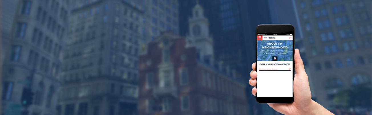
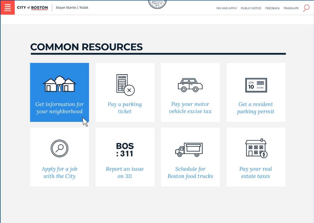
The Department of Information Technology in the City of Boston asked our team of four to redesign a legacy feature based on their existing research. This feature helps residents learn about nearby city amenities and services. We had three weeks to accomplish this task.
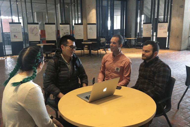
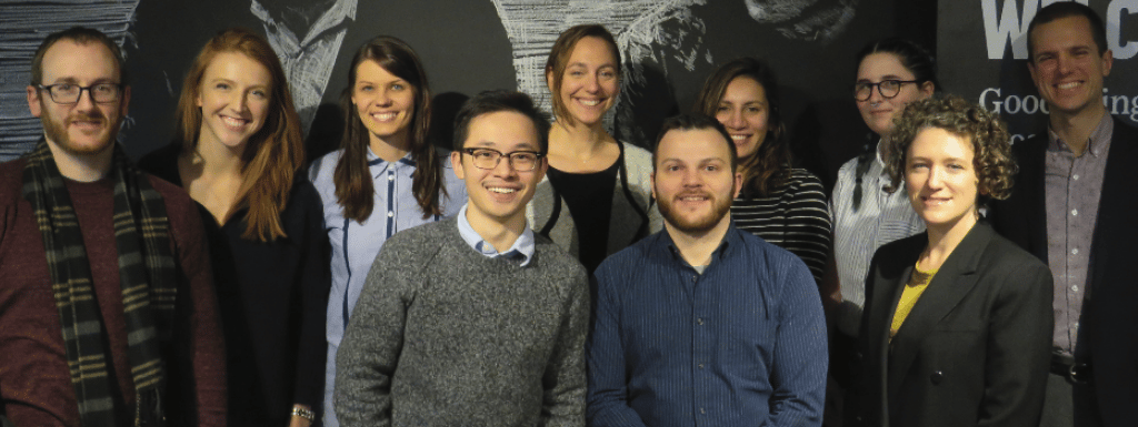
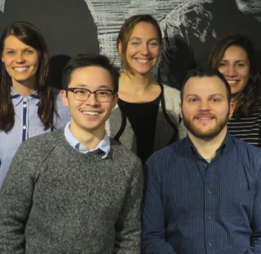
Meet our team alongside the City of Boston’s Department of IT
Planning our work strategy and what we’d deliver to the City of Boston.
To start, we got together and discussed our strengths and preferences to formulate a Team Plan and schedule. We went over how we would go about tackling the project by either splitting work up or by working together for different segments. We also discussed our strategies for decision making, conflict resolution, and communication. We streamlined deliverables to stay within scope and time constraints.
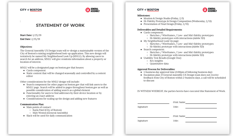
We also needed to create our first Statement of Work with our client. This is all about what we promise to deliver in what time span. This allows us to make sure that we are on the same page as our clients right from the beginning. This project also came at cost for the city: free dollars.
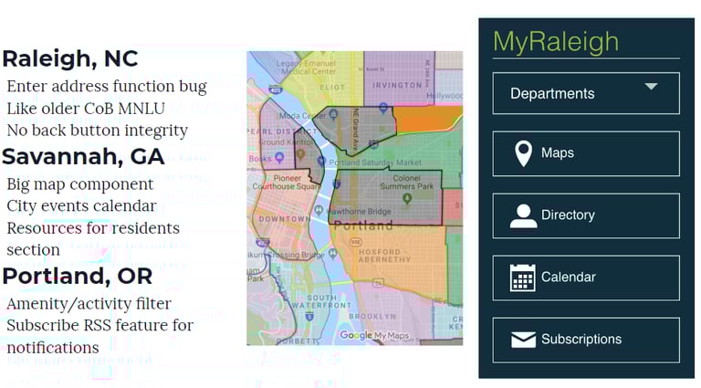
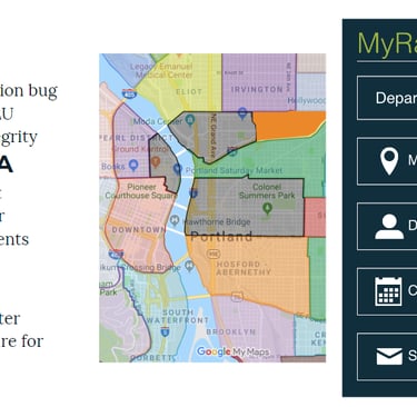
We conducted a comparative analysis to see how other cities address this issue
As a group we analyzed other city websites to better understand how they designed a similar feature. We looked at Raleigh, NC – Savannah, GA – Portland, OR – and found:
There are not really any competitors except Google or Apple Maps which do not give government info like when your trash day is
Other sites did not have a great way of accomplishing this but had elements we liked such as Savannah, GA info of landmarks, community services, etc.
Some of the city sites used a map feature. However, due to past difficulties, the city is trying to stay away from using a map for this feature. So we decided to put the address and distance from location in each category instead. We also gave the city ideas like a copy address button or linking to apple or google maps
Our problem statement
Bostonians need a way to look up city information near their address quickly and easily because it takes time to navigate Boston.gov.
Our solution statement
We believe that by creating an easy to use feature that incorporates all the important city resources, services, emergency info, etc. in one place, then Bostonians will find the site to be more accessible, easier to navigate and more satisfying.
We will know this to be true when we see usage of the feature to reach 5000 plus users in its first 6 month.
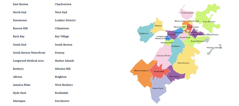
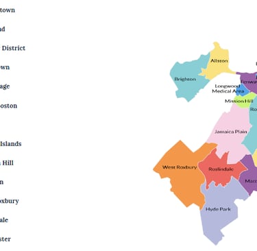
Just-in-case you didn’t know, these are the City of Boston districts: (I didn’t know either).
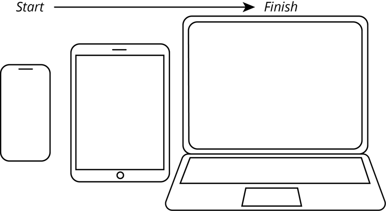
We started with a mobile-first approach for responsive design
We designed for mobile first here because it’s harder to fit everything on a smaller screen. This method is useful because it forces designers to only keep the essentials and get rid of the unessential elements as soon as possible. It’s also much easier to adapt from a small screen to a larger screen since there is more space to play with. Our feature’s sole purpose was to show the user several categories of city amenities and city services. The first issue we encountered as a group was all four of us had our ideas of how this feature should work… How designers solve questions like this is essential to an effective design process, so how did we do it?
For ideation, we conducted a design studio
As an ideation tool we went with the design studio method to organize all of our ideas . This method is often used to foster creativity, come up with successful solutions and to get on the same “idea-train” headed in the same direction. Each person spoke about their design ideas while showing their own sketches. Then the group discussed what they thought worked well and what didn’t after each presentation. We also voted on our favorite elements that others came up with. This allowed everyone’s opinion to be heard and gave us ideas of our own. It truly gives everyone involved more insight for how to solve the same problem in different ways. I’m a big fan of design studios because of the magnitude of work that gets accomplished in such little time.
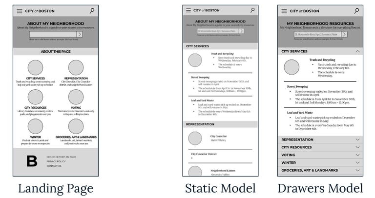
For the conclusion of the design studio, we decided to use drawers to organize each category. Each category would have its own drawer that would drop down to reveal more information. But then we ran into our second issue as a team…
DRAMA!
A difference in opinions? Oh no! Just kidding, we came up with a simple, drama-free tie-breaker.
Another designer and I had different ideas of how the drawers should be presented. My friend and designer Will, thought that all the drawers should be presented in an open state when users first get to the feature. Will believed that approach would allow users to easily understand the layout and scroll through information. Users could then close the drawers if they didn’t want to see a certain category.
I believed that the main purpose of the drawers was to make the categories easily scannable for the users. Then the users would only open the drawers with information they wanted to see. Since, we are not our users, we decided to A/B test both approaches and let the users decide. Crisis solved. (I know, I know, drama would have made this story more juicy)
I promise I’ll let you know what the user feedback was later on. But, let’s pretend this is an exciting cliff-hanger.
My presentation in the design studio:
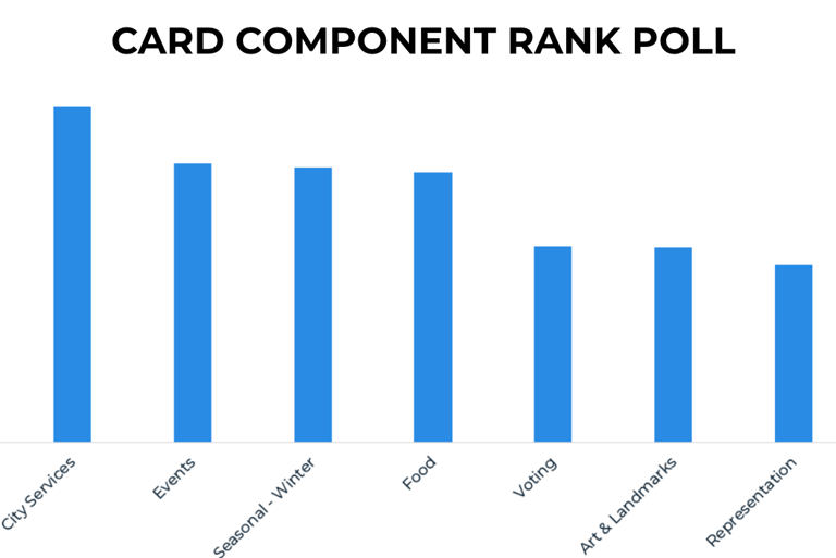
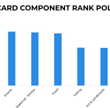
Ranking the importance of the categories using a “slightly clever,” and old school voting solution.
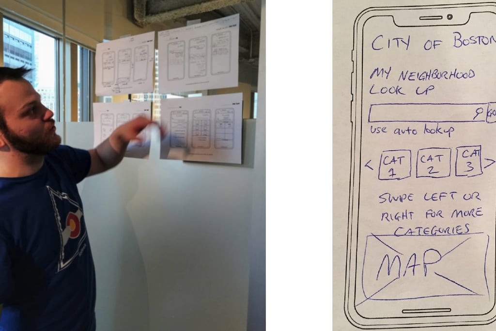
We were not sure which order to put the categories in so we decided to put it up to a vote for our users (instead of listing categories alphabetically, which we didn’t consider at the time). For this vote, we wanted users to rank the categories from one-to-nine based on what they wanted to see most versus least. There was not great way to accomplish this with a standard google form because of their limited options so I went old school and created a paper polling system.
To simplify the adding process since this was done manually by me and me alone, I added each user’s category-preference-number in excel. So if someone like City Services MOST, they gave that category a ONE. (Keep in mind that if a user liked a category the LEAST it got a NINE). So, when added up the more popular categories would have a lower average score. Just like in golf, the lowest score wins. After calculating the average scores in Google Sheets (Google’s Excel), we found City Services and City Resources to be the most popular. So, those categories were the first options users would see.
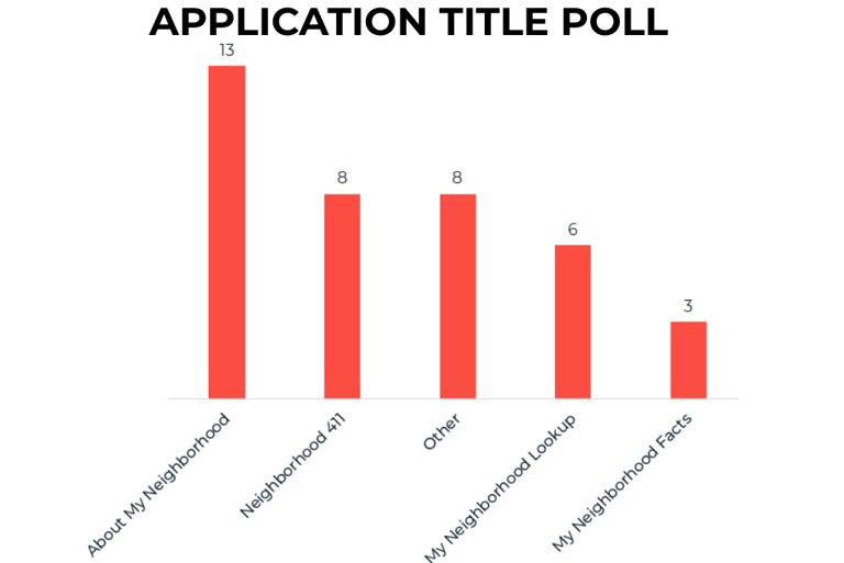
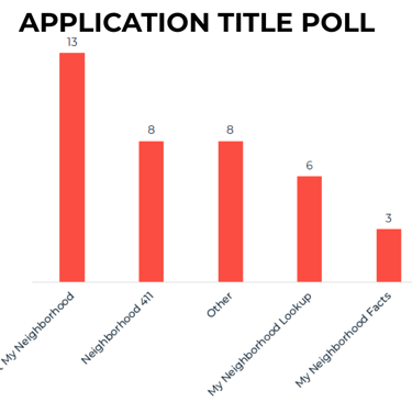
To come up with a name for this feature, we used a similar method, but this involved more steps.
We were not sure what to name the feature. The City of Boston originally called their feature “My Neighborhood Look Up,” but they do not love that title so they asked us to come up with some new options. To do this we had a brainstorming session as a group and came up with all the names we could think of. We each had three points to votes for the titles that we liked most from the list. The top four answers from our voting system was then placed on a google form to ask the public. About My Neighborhood won by five votes.
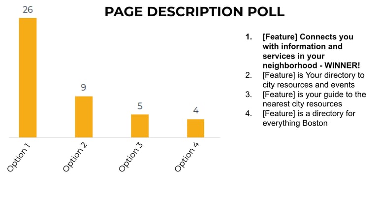
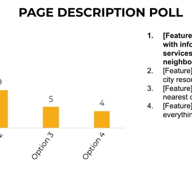
At this point, we might as well use this same process to find the most favorable feature description.
With the same system we used to find the name of the feature we also asked users what they thought was the best description of the feature. We have the description on the same screen as the title to quickly let users know what the feature does.
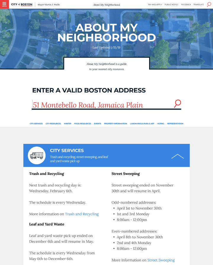
Our mid-fidelity prototype was freshly minted and ready for the gauntlet of usability testing
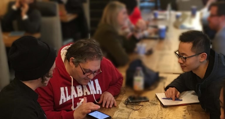
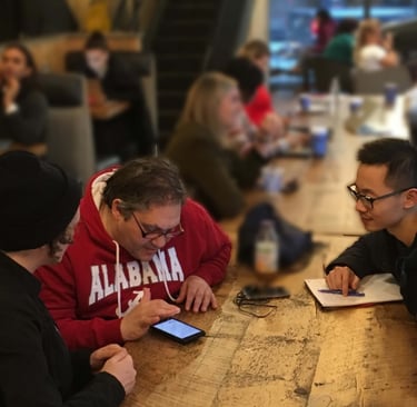
Since we only had two screens for the prototype we decided to design them directly in Sketch and implement into InVision without testing with a paper prototype first. Yes, I know paper prototyping usually saves tons of time and money but a paper prototype wasn’t really an advantage here. It was quick enough to design and looked better for our users. We took to the streets for our first round of usability testing.
User’s Scenario- You just moved to Jamaica Plain and you’re interested in city resources that affect your neighborhood. Please find what day trash day is on for your new location. Also, find the date of the next event near your location.
“Polling location right there! That was easy, very easy. For someone not that ‘computer savvy’, [drawers model] puts all the info right there.” -Dave
Our iterations after usability testing:
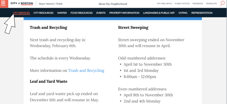
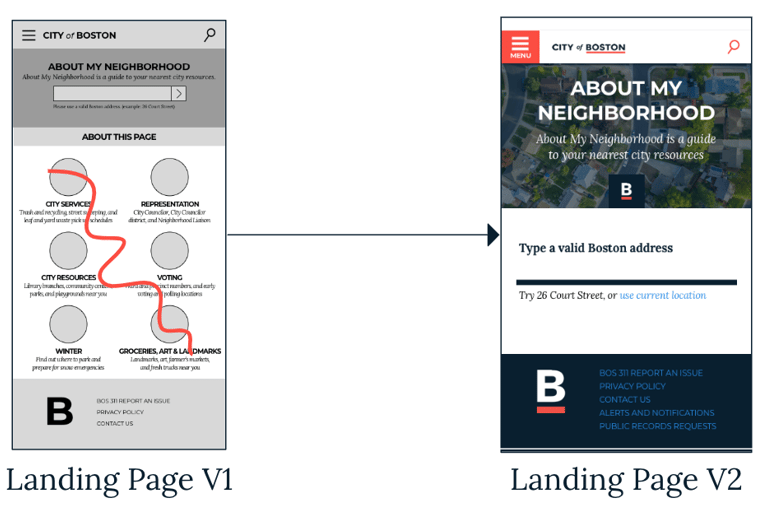
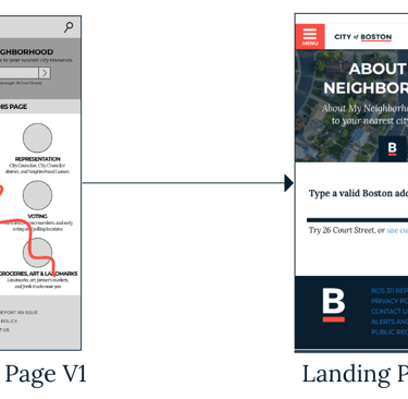
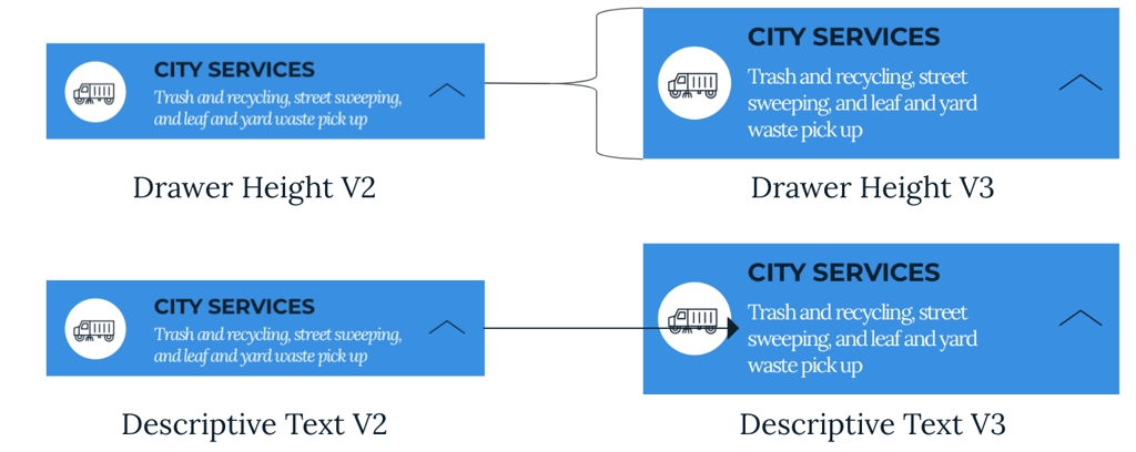
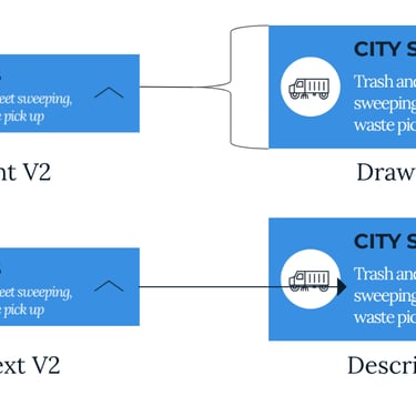
Feedback & solution: On our first landing page we had icons and a description underneath to inform the user what to expect to find in each category. We found that users were trying to use these icons as buttons instead. So we decided to scrap that idea and instead have the icons and descriptions on the drawers themselves.
At this point, we might as well use this same process to find the most favorable feature description.
With the same system we used to find the name of the feature we also asked users what they thought was the best description of the feature. We have the description on the same screen as the title to quickly let users know what the feature does.

Feedback and solution:
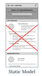
Our users did not like the all open drawer idea and found it very confusing. They would scroll over the information they were looking for. They loved the closed drawers and found it much more intuitive. So our closed drawer version was chosen for the A/B test.
Feedback and iterations:
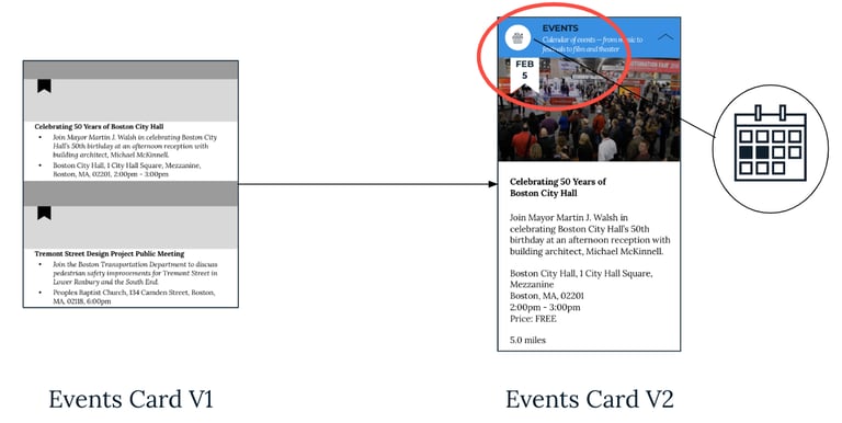
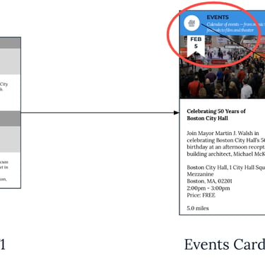
The events category did not have a big enough banner to hold the date of event inside it. Also, this section was not originally a drawer because it was supposed to stand alone as a promotional addition at the bottom. However, users wanted continuity and so we created a drawer for this category to match the rest.
We wanted to design this feature to the best of our abilities, so we kept on testing and editing.
The rest of the testing we conducted for the mobile site revealed small problems that small adjustments like the readability, wording, spacing, etc..
Reflection on my time with the City of Boston.
This was an excellent real world project and I am grateful to the City of Boston for giving us this opportunity. One additional element I would like to have added to this project is allowing the user to hide or filter certain categories if they’re uninterested in them. This would be more beneficial if the City wants to add additional categories in the future.
After our class ended we were invited to come back and further help the City of Boston. We were asked to conduct A/B testing on a new login they have as well as further develop and test our existing feature. We will also be featured in their upcoming blog which will be posted here when it’s ready! Working with the city is great because of our ability to reach out to hundreds of thousands of users.